There are two ways a rich text editor can be accessible, and they’re easy to mix up. One is whether a person with a disability can operate the editor itself: tab to the toolbar, open a menu with the arrow keys, hear what the Bold button does. The other is whether the content that person produces is accessible to whoever meets it later: the reader whose screen reader narrates the published article, the visitor expanding a collapsible section.
I wrote about the first kind before, the work to make every toolbar, menu, and picker keyboard- and screen-reader-friendly. That post ends with a table of things it deliberately skipped, and image alt text is on it, filed under “content authoring policy, not editor responsibility.”
I still think enforcement, forcing every image to carry alt text before you can publish, is the author’s call and not the editor’s. But that table leaned on a second claim, that “the alt attribute is fully supported,” and that one didn’t hold up. Alt text was settable at the moment you inserted an image and never again. Supported, technically; uneditable, in practice. 0.11.0 fixes that, and closes a related gap in the details block.
The alt text you never get to fix
Before 0.11.0, an image’s alt text could only be set while you were inserting it: type it into the insert popover, or never. That is exactly the wrong moment to ask. When you paste an image you are thinking about getting it onto the page, not composing a one-sentence description of it for someone who can’t see it. So the field sat empty, you moved on, and there was no way back. The image was on the page; its alt text was permanently blank.
The fix is to put the affordance where you actually look at the image: on the image, after it’s there. Select an image and the bubble menu gains an Edit alt text action. It opens a small menu with a single field, pre-filled with whatever alt the image currently has, anchored to the image so it tracks the thing you’re describing.
Two details make it usable rather than merely present. The menu is alt-only: no URL field, no re-upload, nothing to accidentally change about an image you only wanted to annotate. And the action shows active when the image already has alt text, so an image still missing it stands out at a glance:
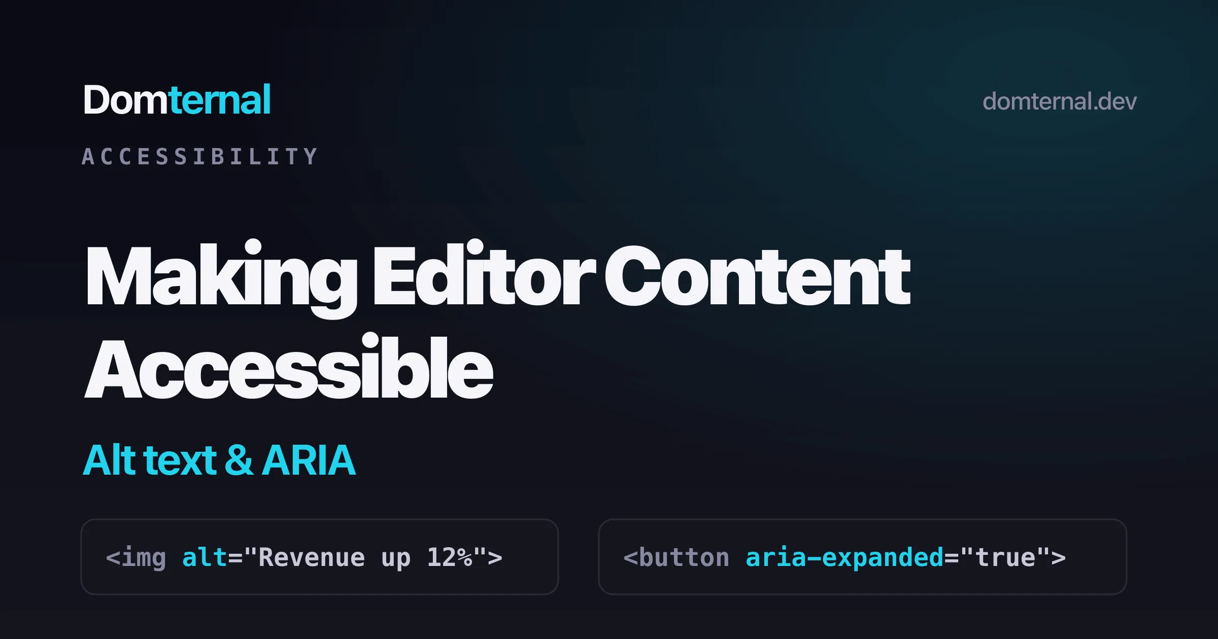
// The "Edit alt text" action lights up only when the selection// is an image that already carries a non-empty alt.isActiveFn: (editor) => { const sel = editor.state.selection; return Boolean(sel.node?.type.name === 'image' && sel.node.attrs.alt);}A selected image is a NodeSelection, so the check reads the selected node directly instead of walking the cursor’s ancestors, which would never find an atom. The alt you type is stored on the node and travels with the image into your exported HTML as a plain alt="...", which is all a reader’s screen reader ever needed.
What goes in the field
The editor can’t write good alt text for you, but the two rules that matter most are easy. Describe what the image means in context, not what it looks like pixel by pixel: “Quarterly revenue up 12 percent” beats “bar chart.” And if an image is purely decorative, a deliberately empty value is the correct answer, not a cop-out: it tells assistive technology to skip the image instead of reading out a filename. The field supports both, a description or an intentional blank.
A disclosure that announces itself
The other gap was in the details block, the collapsible “click to expand” section. It looks like the browser’s native <details> / <summary>, but it can’t be one. An editable, draggable, themeable block needs an element tree the editor fully controls, so the toggle is a <button> and the body is a <div>. The catch is that a native <details> announces itself to a screen reader for free (“collapsed”, then “expanded”), while a bare <button> next to a <div> announces nothing. To a screen reader user the old version was a button with no hint that it controlled anything, or what state it was in.
0.11.0 wires up the disclosure pattern by hand. The toggle declares what it controls and whether it’s open, and the state updates every time the section flips:
<!-- before: a button that controls nothing, in no particular state --><button>Summary</button><div>...hidden content...</div>
<!-- after: a labelled disclosure with live state --><button aria-label="Toggle details" aria-expanded="false" aria-controls="dm-details-content-1">Summary</button><div id="dm-details-content-1">...hidden content...</div>
Now a screen reader announces it as a collapsed, expandable control, and aria-controls ties the button to the region it reveals. aria-expanded flips to true the moment the section opens, so the announced state is never stale. Each details block gets a unique content id, so the wiring holds up when a document has more than one.
Accessibility that’s already on
These two close gaps in a longer pattern: the defaults lean the safe way so you don’t have to remember to opt in. The math extension renders every equation with a hidden MathML annotation that assistive tech actually reads, and isolates LaTeX as left-to-right so it stays legible inside a right-to-left document. The toolbars, menus, and pickers got their full keyboard and ARIA pass earlier. Editable alt text and the details ARIA are the same idea pointed at the content you produce: the accessible result is the one you get without doing anything special.
Shipping in 0.11.0
Editable image alt text lives in @domternal/extension-image and the details ARIA in @domternal/extension-details, both as of 0.11.0. Neither is opt-in; update the package and the affordances are there. The full list of changes is in the changelog.
- Image node docs - schema, the
alt/titleattributes, float, and the bubble actions - Details node docs - the collapsible block, its options, and now its ARIA
- The earlier accessibility work - keyboard navigation and ARIA across the editor’s own UI
- GitHub - MIT licensed, issues and stars welcome
Good alt text is still your job. Somewhere to write it, and a widget that says what it’s doing, are the editor’s.