Content types
The nodes that are more than text. Each is a real ProseMirror node with its own schema, commands and node view, not markup pasted into a paragraph and hoped for.
Most of what an editor does only shows up once you interact with it. This page collects every user interface surface Domternal ships, in both the classic and the Notion-style preset, with a link to the reference documentation for each. Everything here is part of the free, MIT-licensed packages.
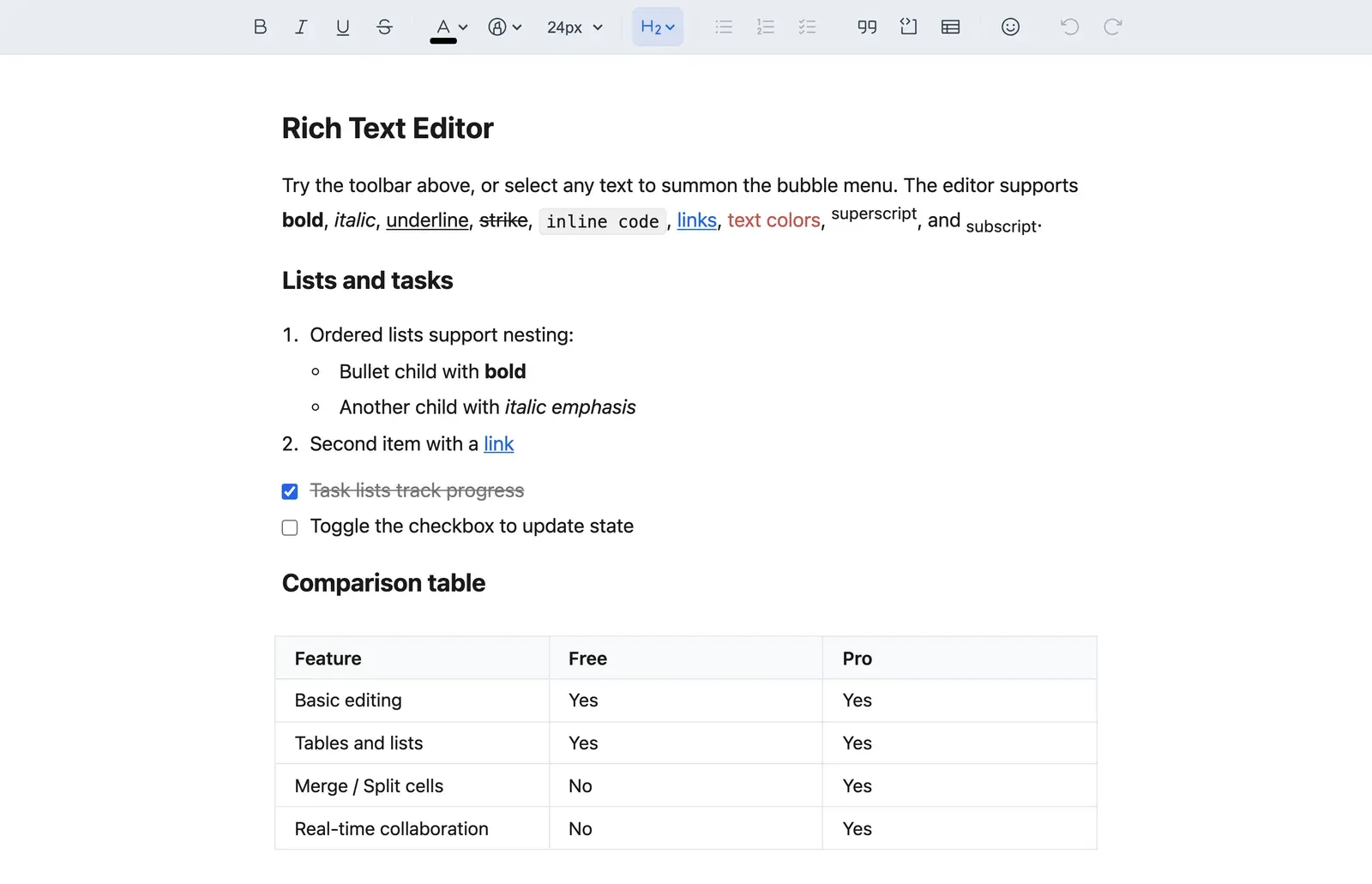
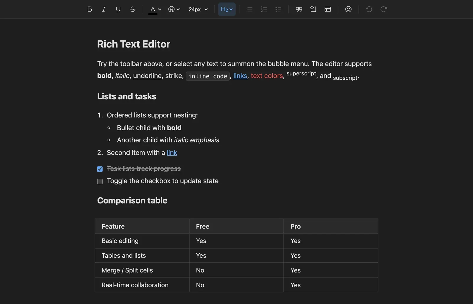


Prefer to drive it yourself? Open the live playground or read the getting started guide.
Marks are the same commands wherever you run them from. What changes is the surface: a strip that is always there, a menu that follows the selection, or a shortcut that opens a popover exactly where the caret is.
The toolbar is not a fixed list. Each extension contributes its own items through addToolbarItems(), so enabling the table package adds table controls and nothing else has to know. Groups, separators and dropdowns are assembled from whatever is registered, and every item exposes its active and disabled state to the button that renders it.


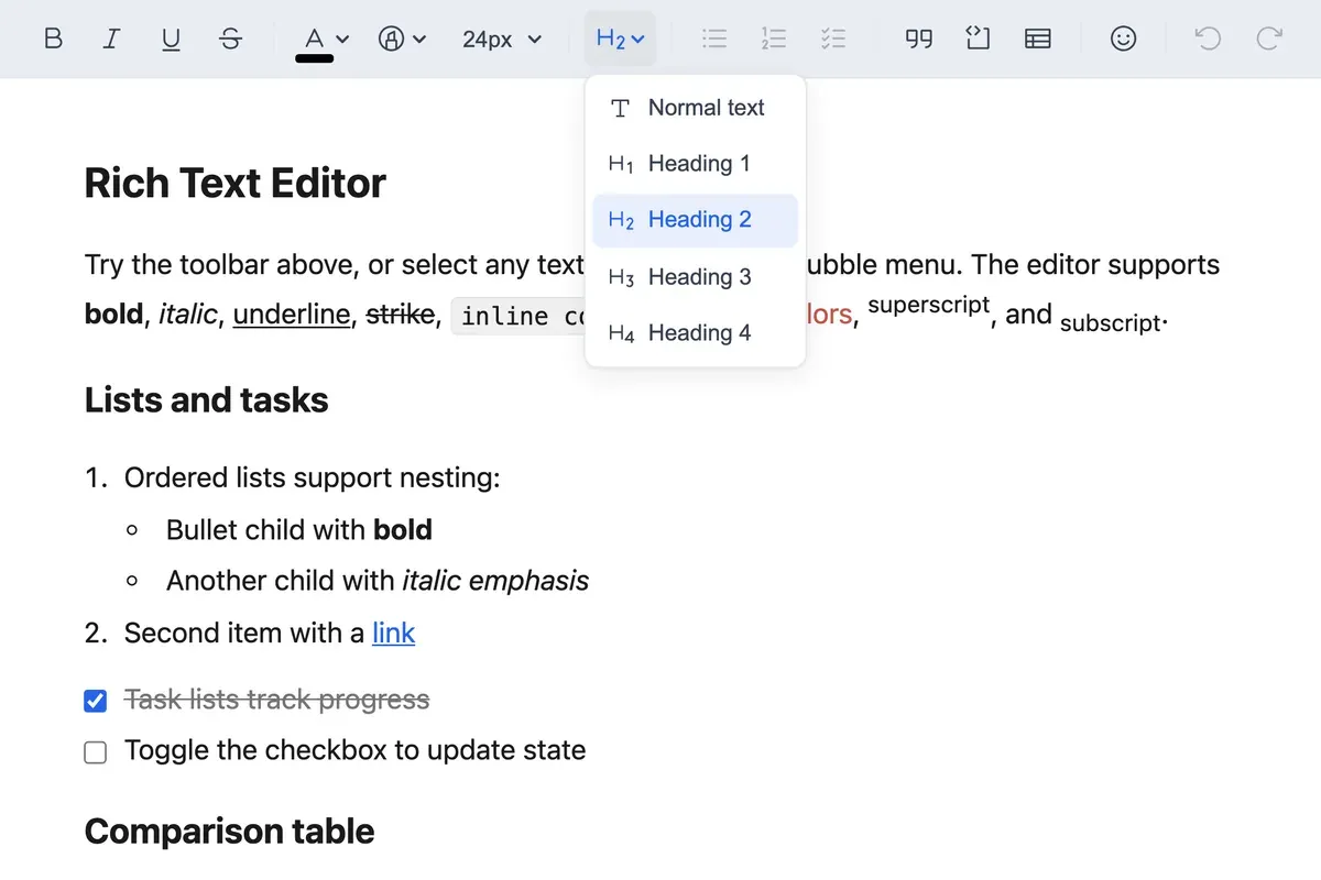
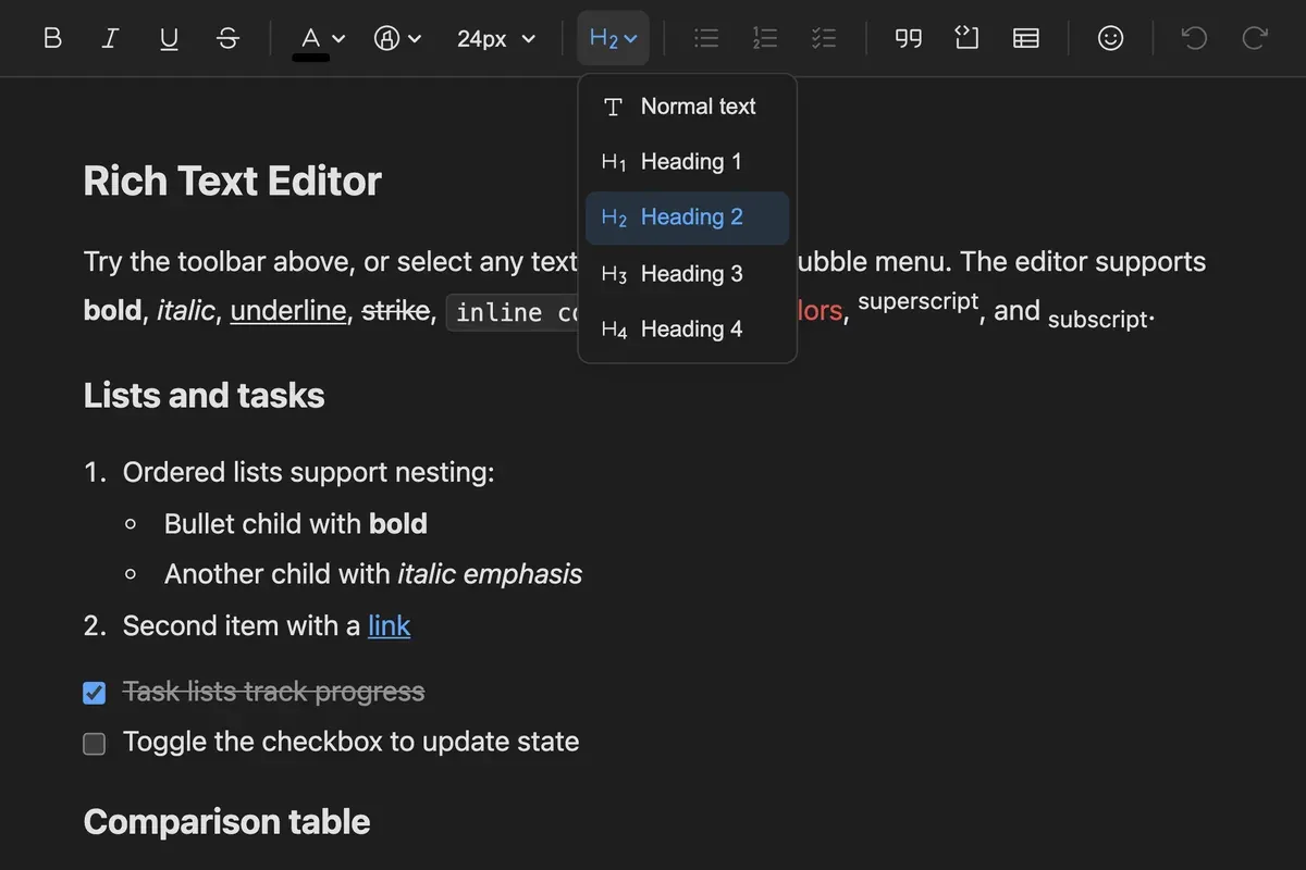
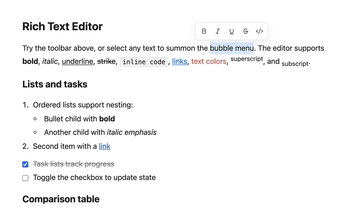
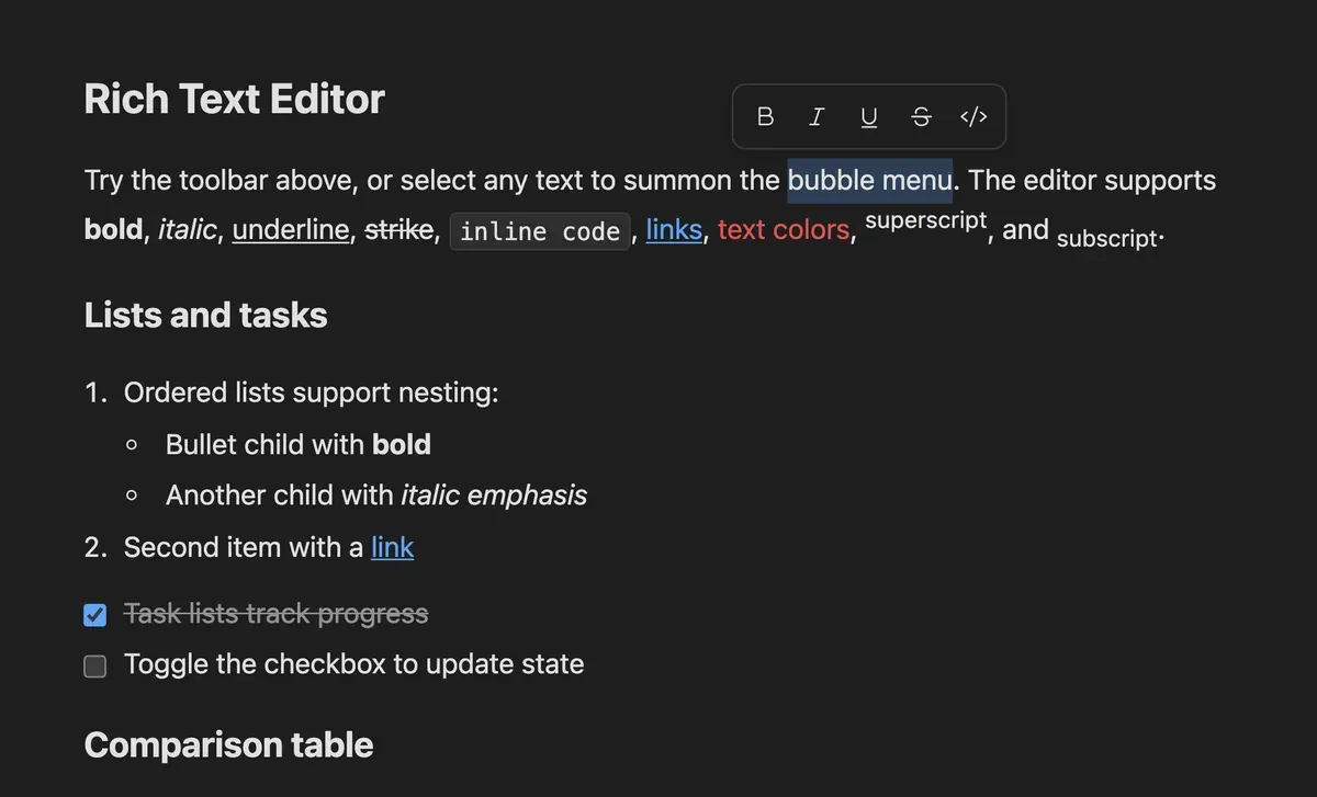
Select text and a compact menu follows the selection. It is positioned with @floating-ui/dom against an absolutely positioned host inside the editor, so scrolling costs no JavaScript at all: the compositor moves it. Which buttons appear is a plain array, so a comment or AI action drops in next to bold.
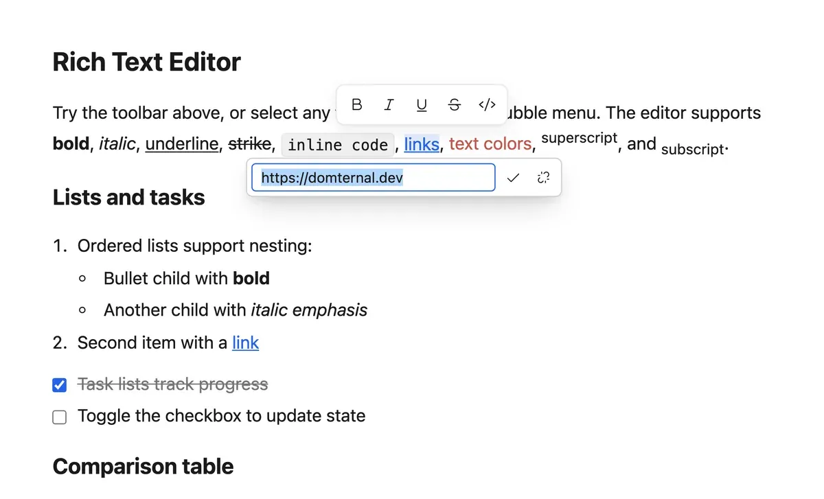
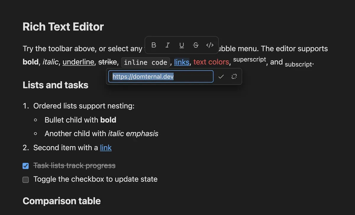
Mod-K on a selection opens the URL field in place, and clicking a link that already exists reopens it with the address filled in and Remove sitting next to Apply. The range the link will cover stays highlighted while you type, so you can see what you are about to attach it to.
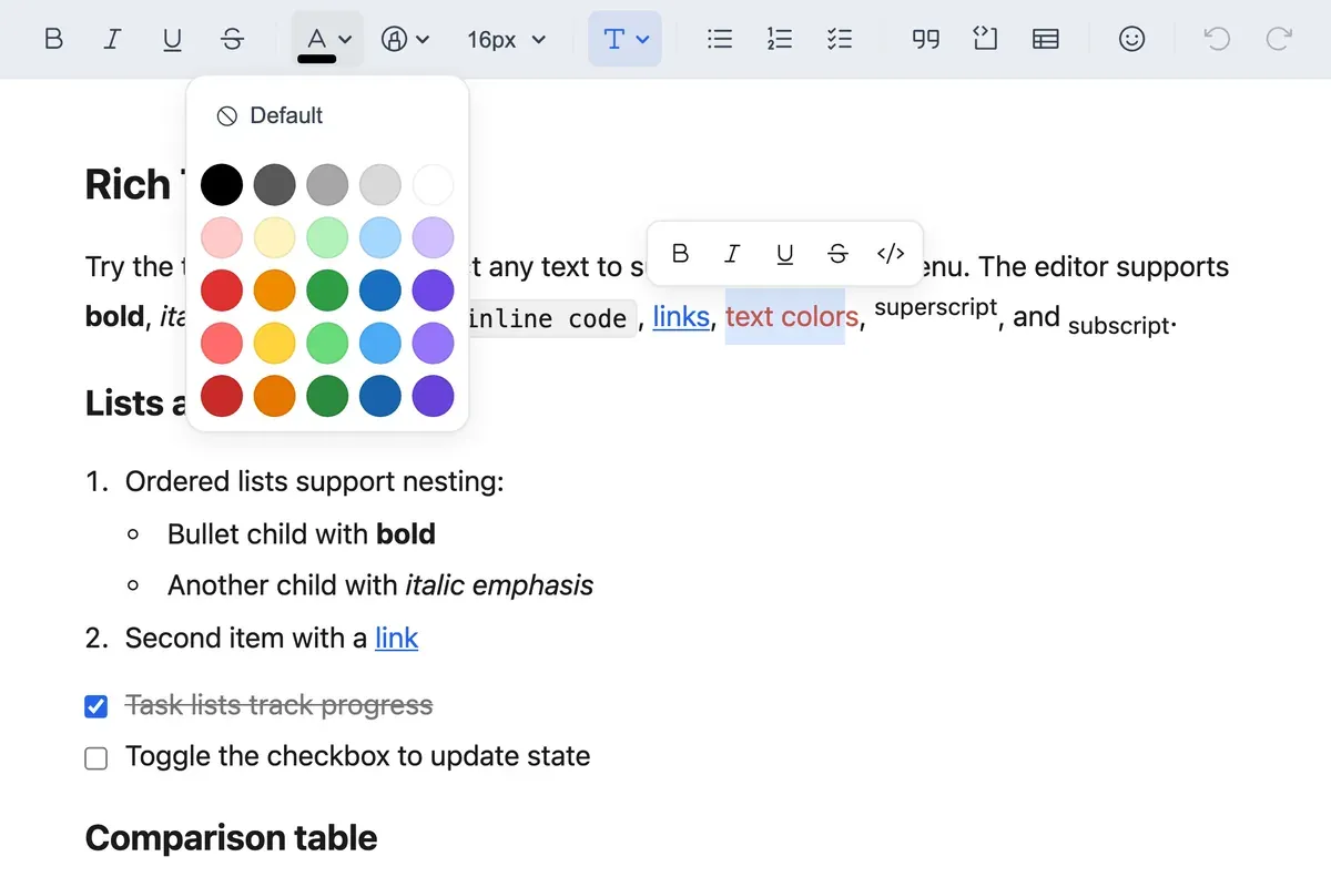
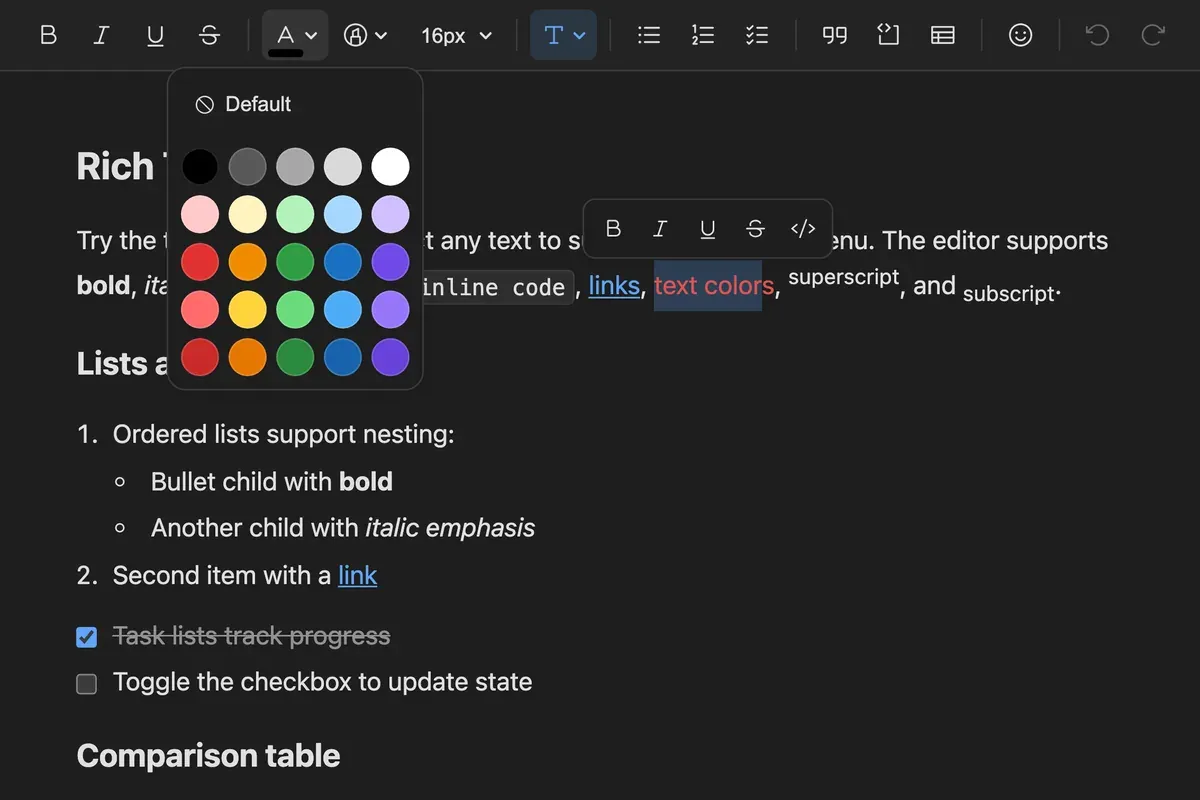
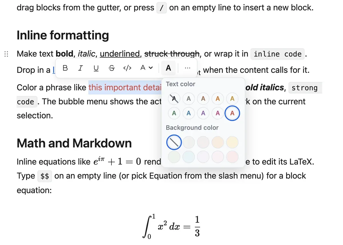
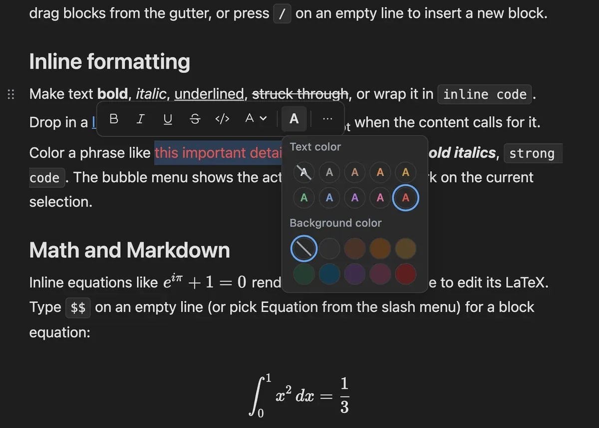
Two surfaces over one set of tokens. The toolbar opens a grid palette for text colour and highlight with the active swatch marked, and the bubble menu opens the Notion-style panel that covers text and background together. Both write the same text-style mark, so a colour set in one reads as active in the other.
Everything in the document is a block, and every block gets the same grip, the same menu and the same drag behaviour, whether it is a paragraph or a table.
Hover a block and a grip appears in the gutter beside it, with a plus button to insert below. Dragging reorders, and dragging onto the edge of a list item nests instead. The handle knows which node types accept which children, so it will not let you drop a heading inside a table cell.
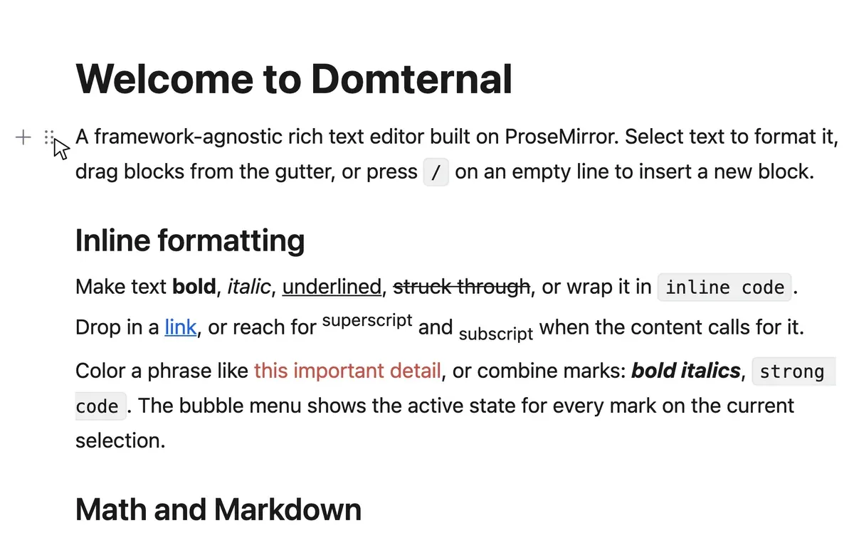
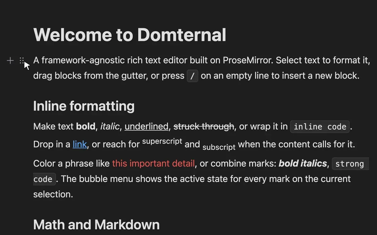
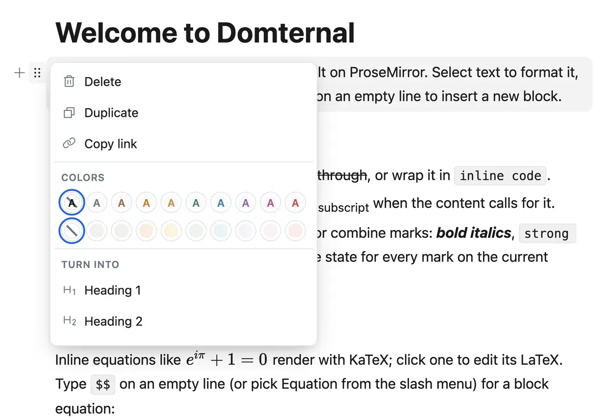
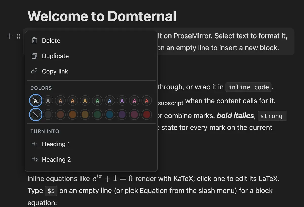
Clicking the handle opens the block menu: delete, duplicate, copy a link straight to that block, set a text or background colour, or turn the block into another type. Turn into preserves the text and replaces the node around it, so a paragraph becomes a heading without retyping anything.
A disclosure block with an editable summary row and a collapsible body that accepts any block content: lists, code, even another toggle. The chevron is a real button with aria-expanded and aria-controls pointing at the body, so the open state is announced rather than left for a screen reader to infer.
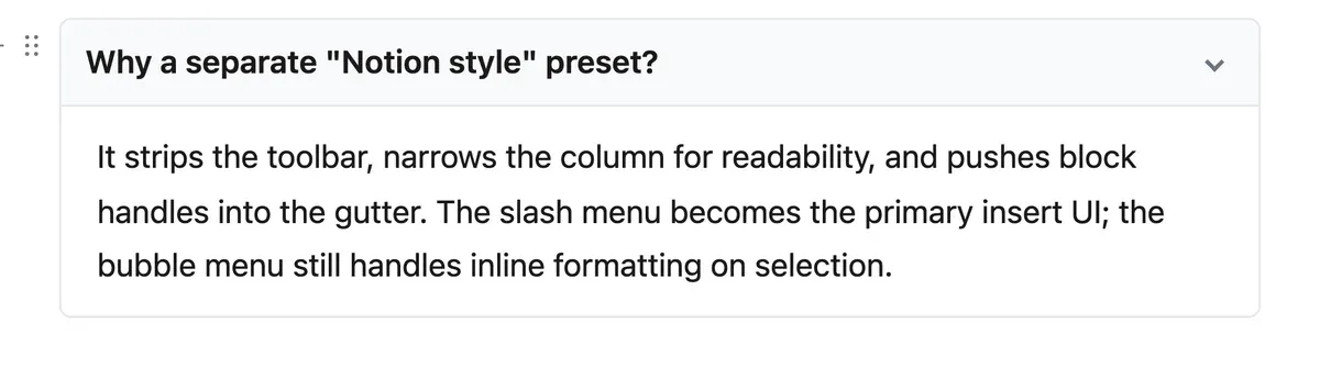
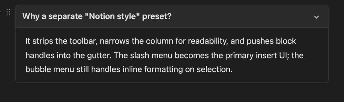
Checkboxes are a node view rather than a character, so clicking one dispatches a transaction and the checked state lives in the document. They nest with Tab like any other list and mix freely with bullets and ordered items at any depth, and Backspace at the start of the first item lifts out instead of merging upward.
Three ways to put a new block in the document, sharing one item registry: whatever an extension registers appears in all of them at once.
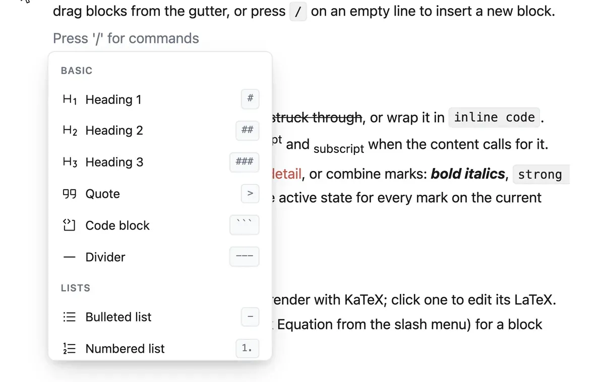
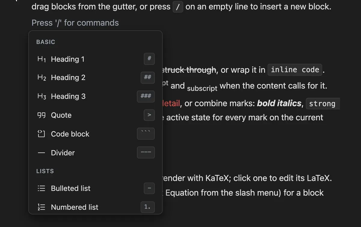
Type a slash on an empty line and the insert menu opens where the caret is. It filters as you type, groups results, and shows each item with its icon, description and shortcut. Arrow keys move, Enter inserts, Escape closes and leaves the slash you typed as ordinary text.
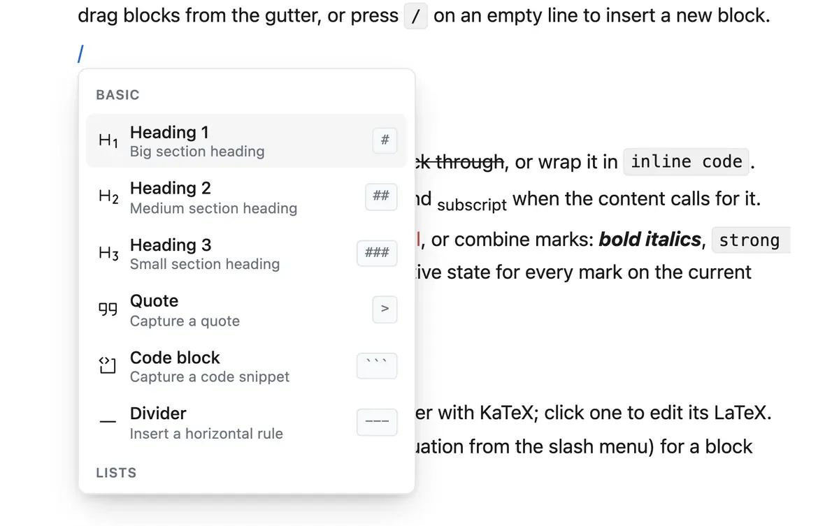
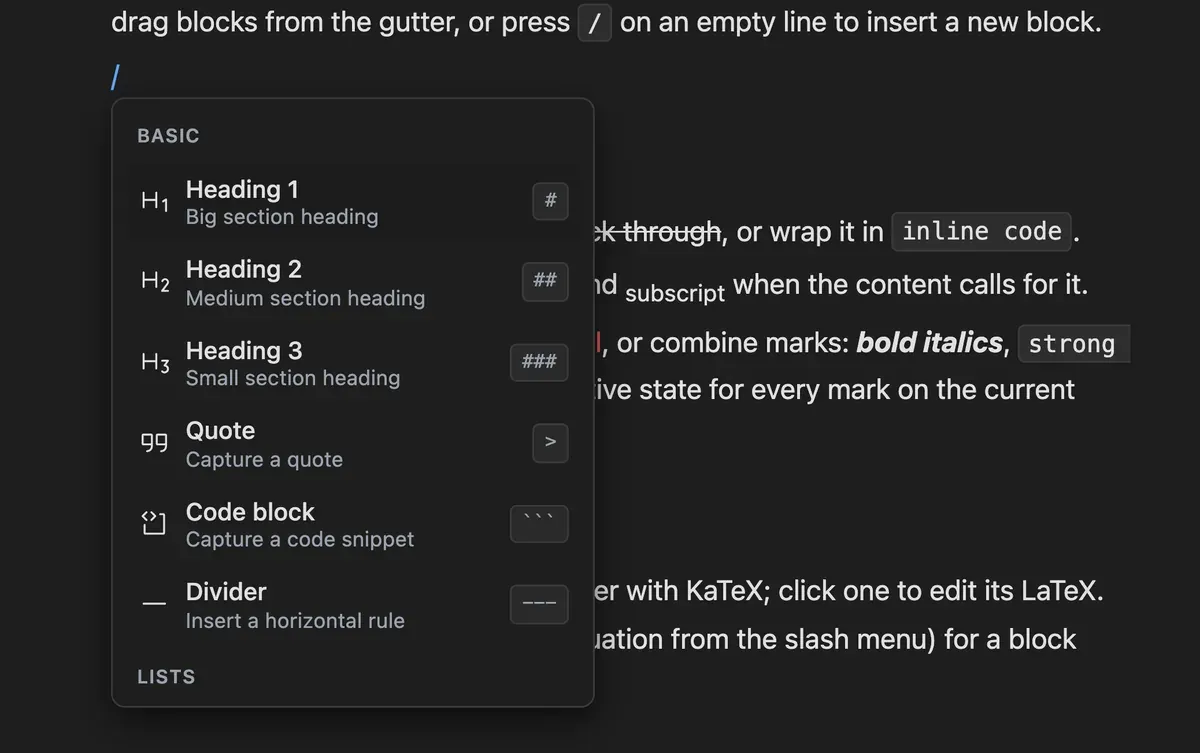
The same items as the slash menu, opened from the plus button in the gutter instead of the keyboard. It keeps the group labels and shortcut hints that a filtered slash query hides, which makes it the better way to find out what is insertable in the first place rather than to insert something you already know.
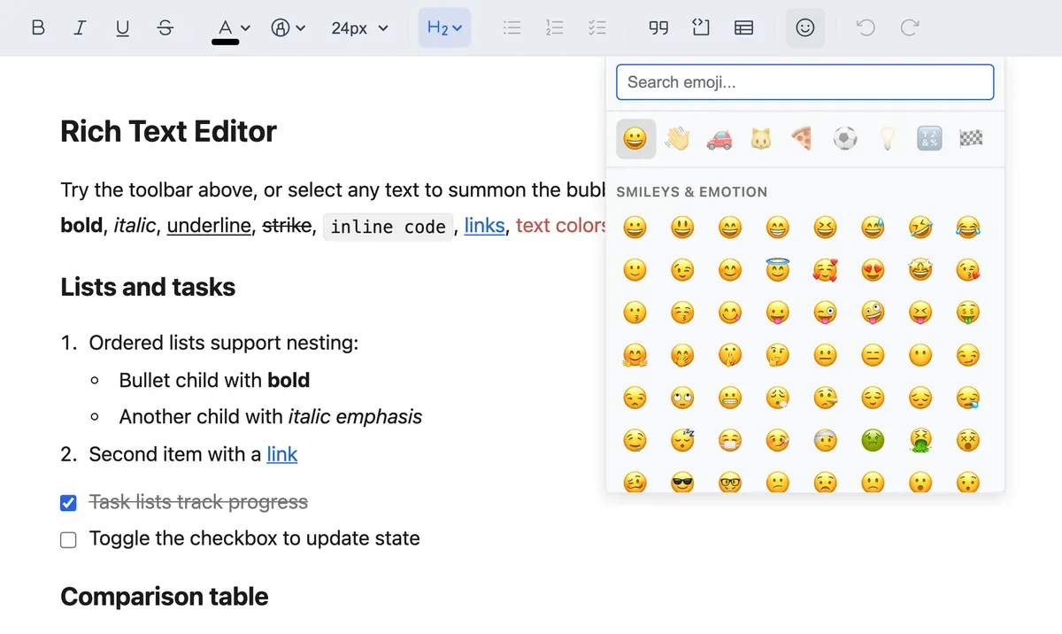
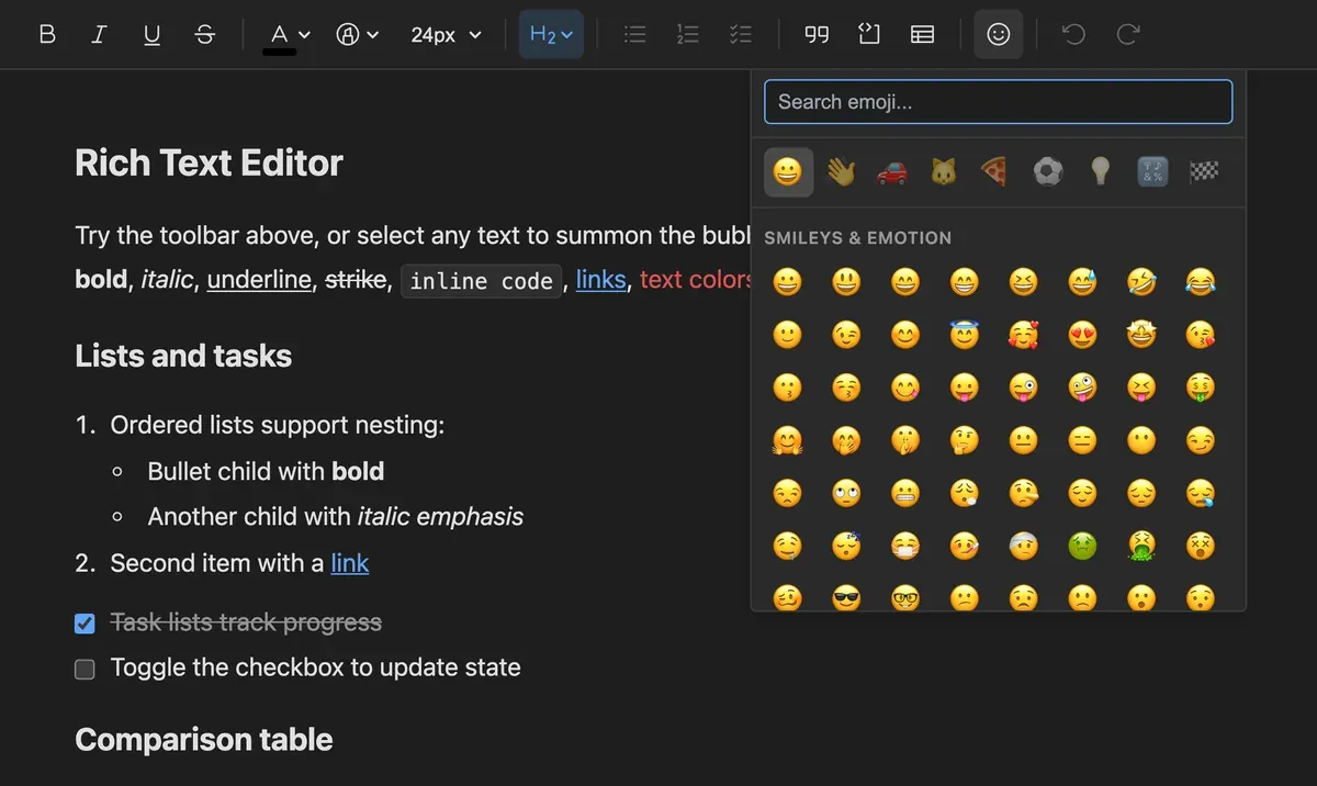
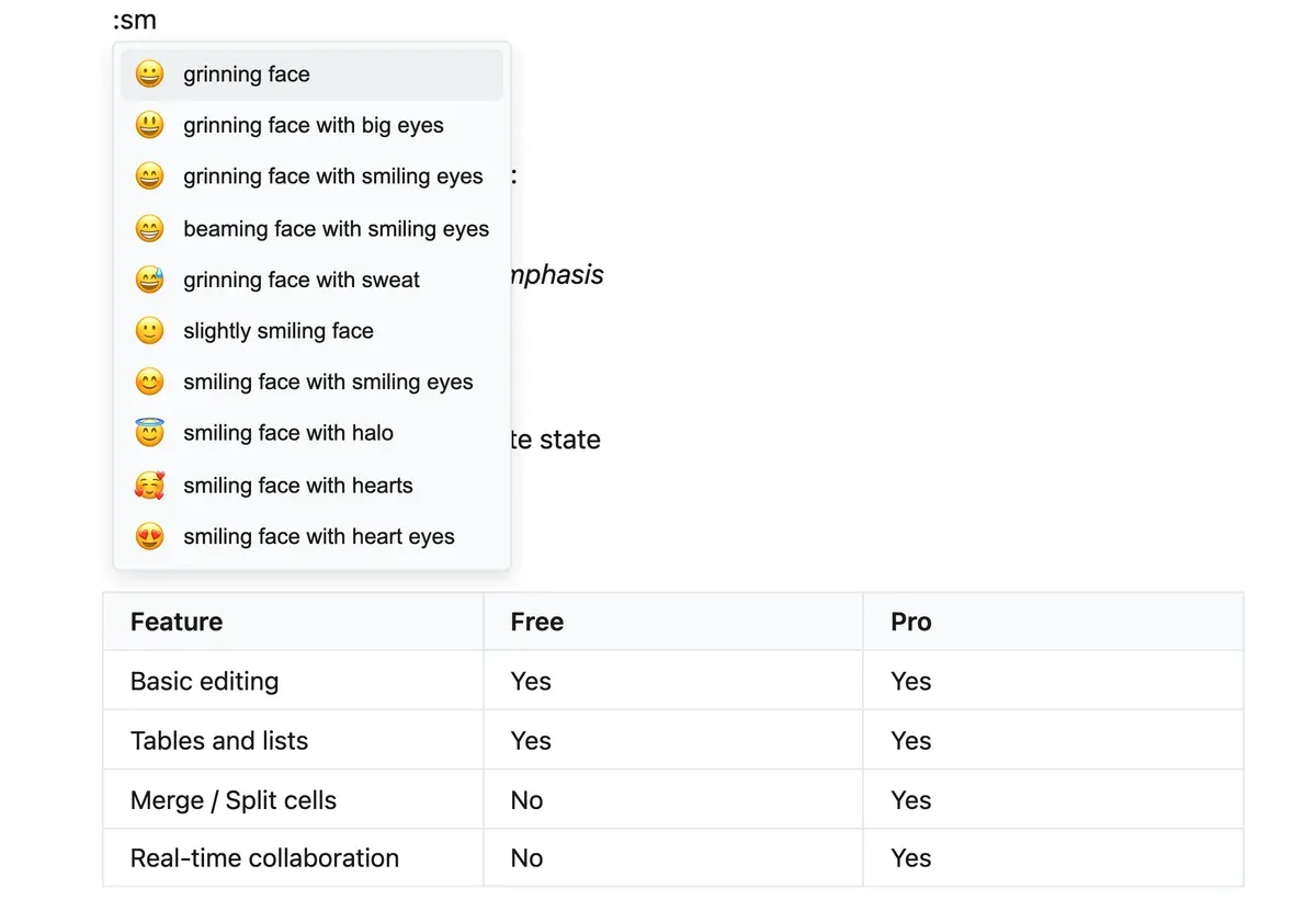
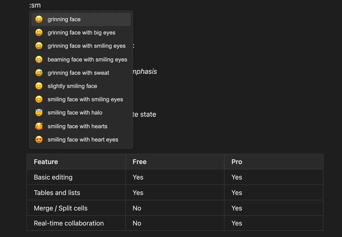
The picker offers search, nine category tabs and a keyboard-navigable grid. Typing a colon opens the same set inline as a suggestion list, and both shortcodes and typed emoticons convert through input rules, so three different routes reach the same inline node.
The nodes that are more than text. Each is a real ProseMirror node with its own schema, commands and node view, not markup pasted into a paragraph and hoped for.
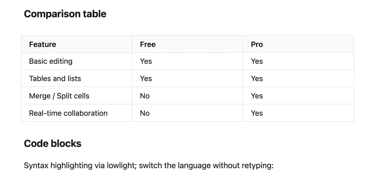
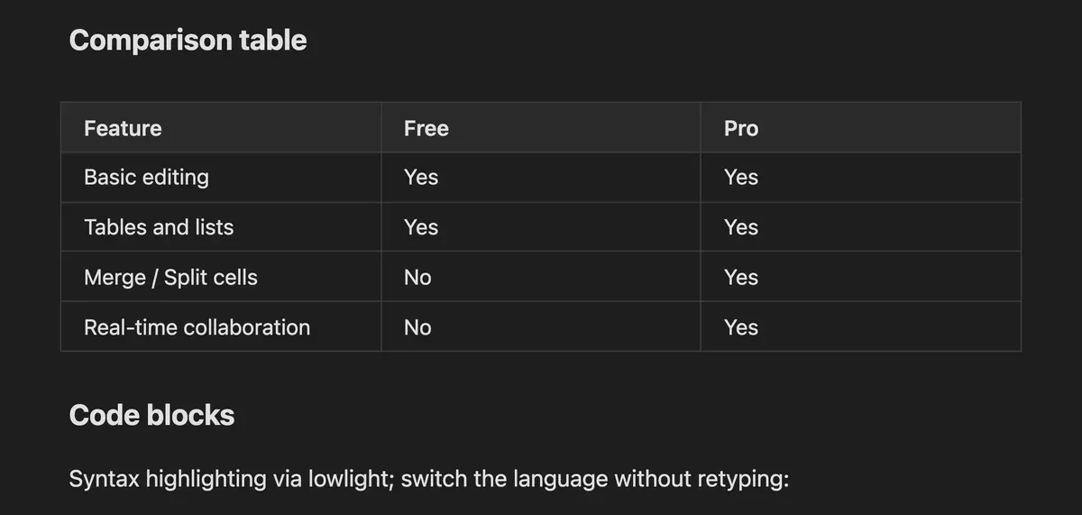
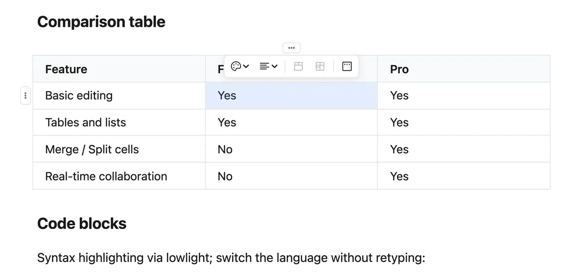
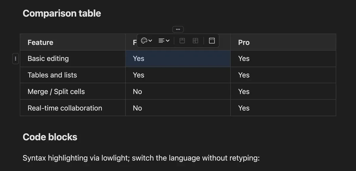
Tables are a first-class node with eighteen commands. Row, column and corner grips appear on hover: the corner opens a cell toolbar with alignment, cell colour and a header toggle, and each axis grip opens the insert, delete, merge and split actions that apply to it. Columns resize by dragging their borders.
Insert from the slash menu and a popover asks for a URL and alt text, with a Browse button for a local file. Once placed, four corner handles resize it live, and the bubble menu switches to image actions: inline, float left, centre, float right, edit the alt text, delete. Pasting or dropping a file uploads it behind a placeholder.
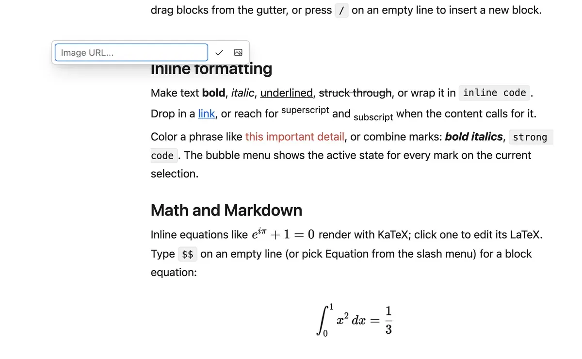
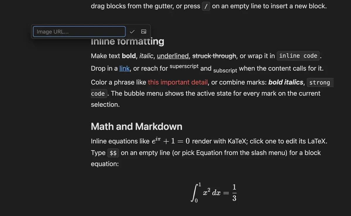
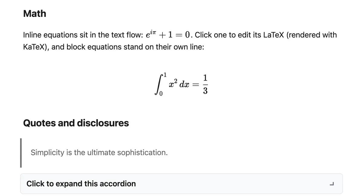
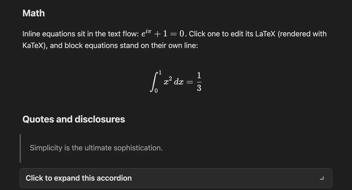
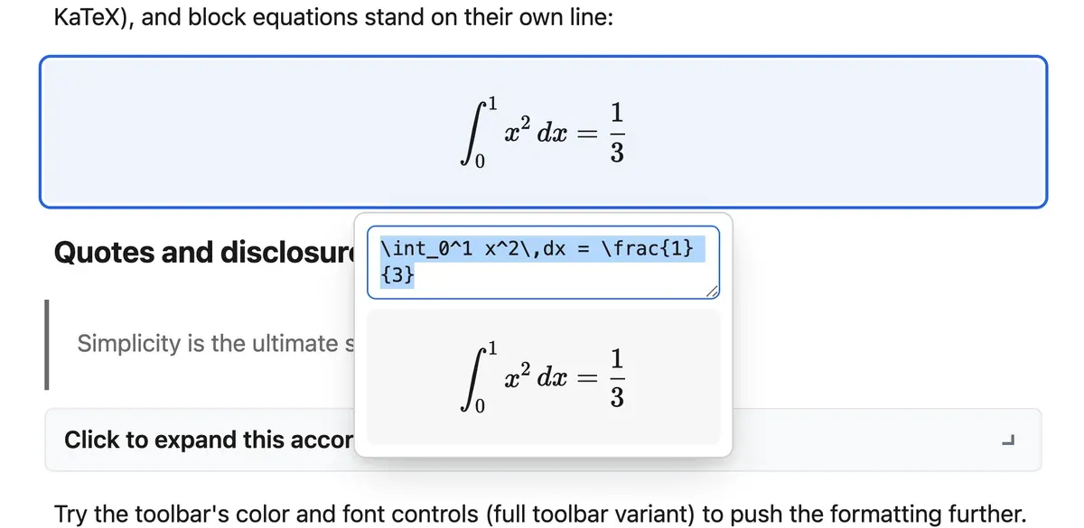
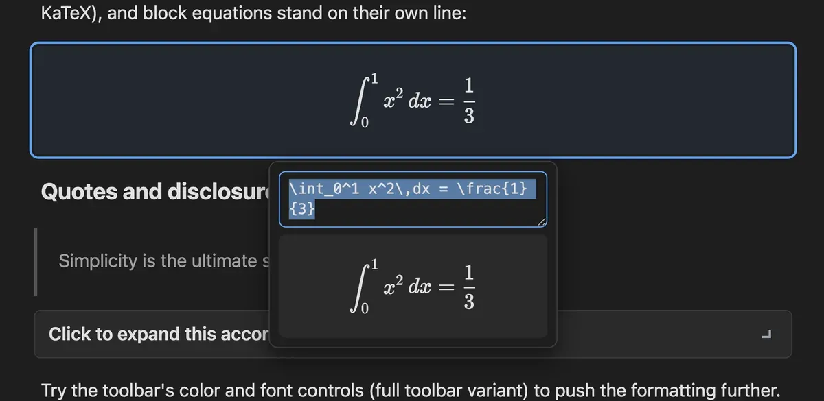
Inline equations sit in the run of text and block equations stand on their own line, both rendered through a pluggable renderer with KaTeX as the default. Click one and a popover opens with the LaTeX in an editable field and a live preview beneath it, so the result is visible before you commit to it.
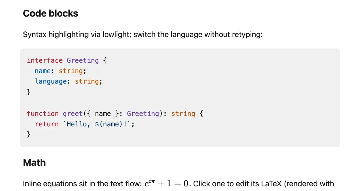
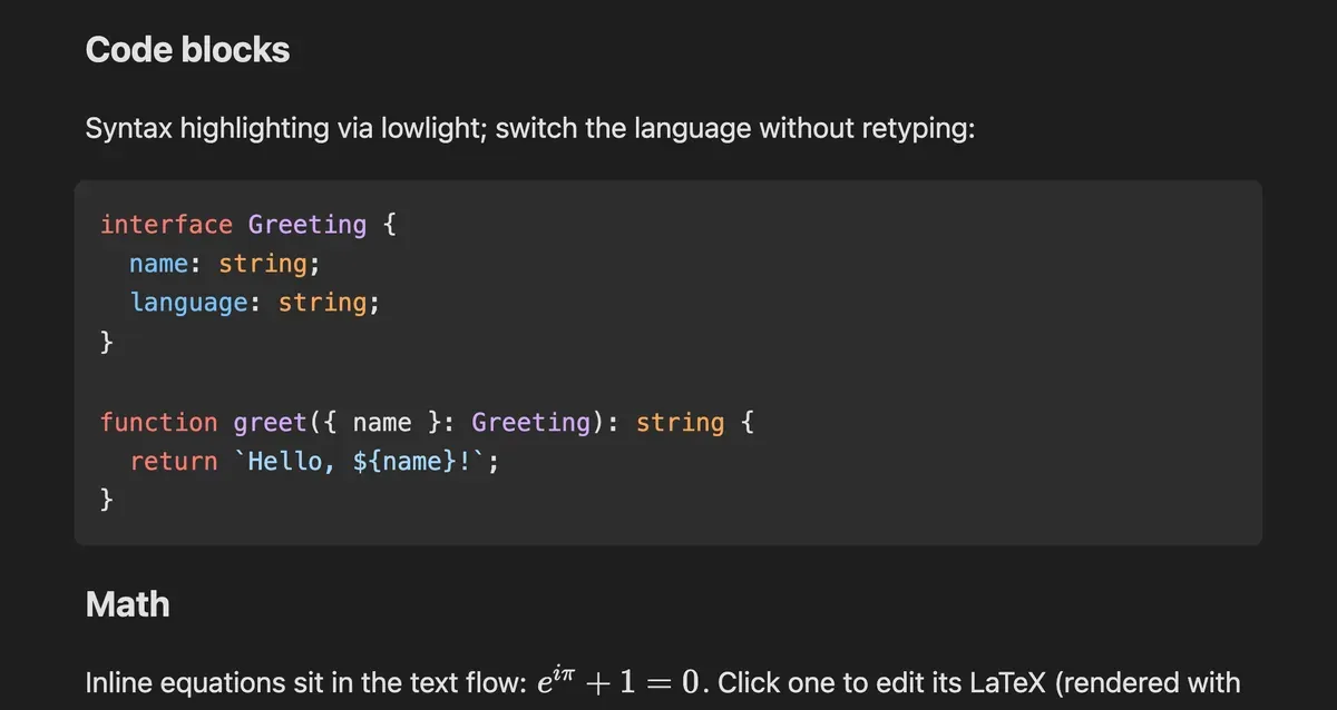
Code blocks highlight through lowlight, with the common language set rather than the full registry so the chunk stays small. Language is stored on the node, Tab indents inside the block instead of leaving it, and pasting a fenced Markdown block creates one directly.
Markdown is a two-way door. Pasting a document as plain text converts it into real blocks, and the same serializer turns the document back into GitHub-flavored Markdown, with a one-call helper that hands the reader a .md file. A round trip is lossless for everything the schema can express.
The parts that never make a feature list and decide whether the editor feels finished.
A tick per heading sits at the edge of the document and expands into a full outline on hover, tracking the scroll position to mark the current section. The same extension inserts an in-document outline block, which updates as you write and links to each heading.
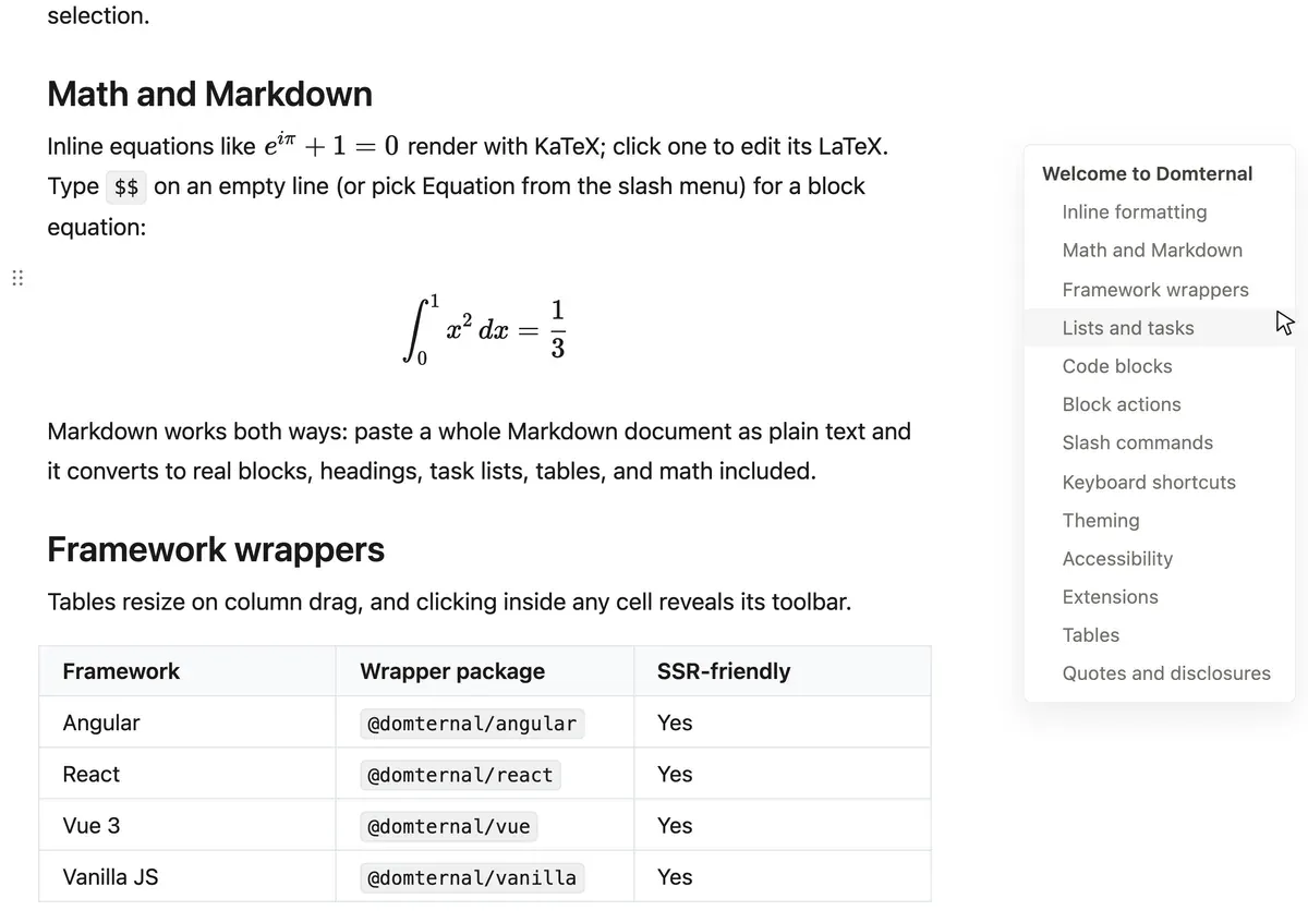
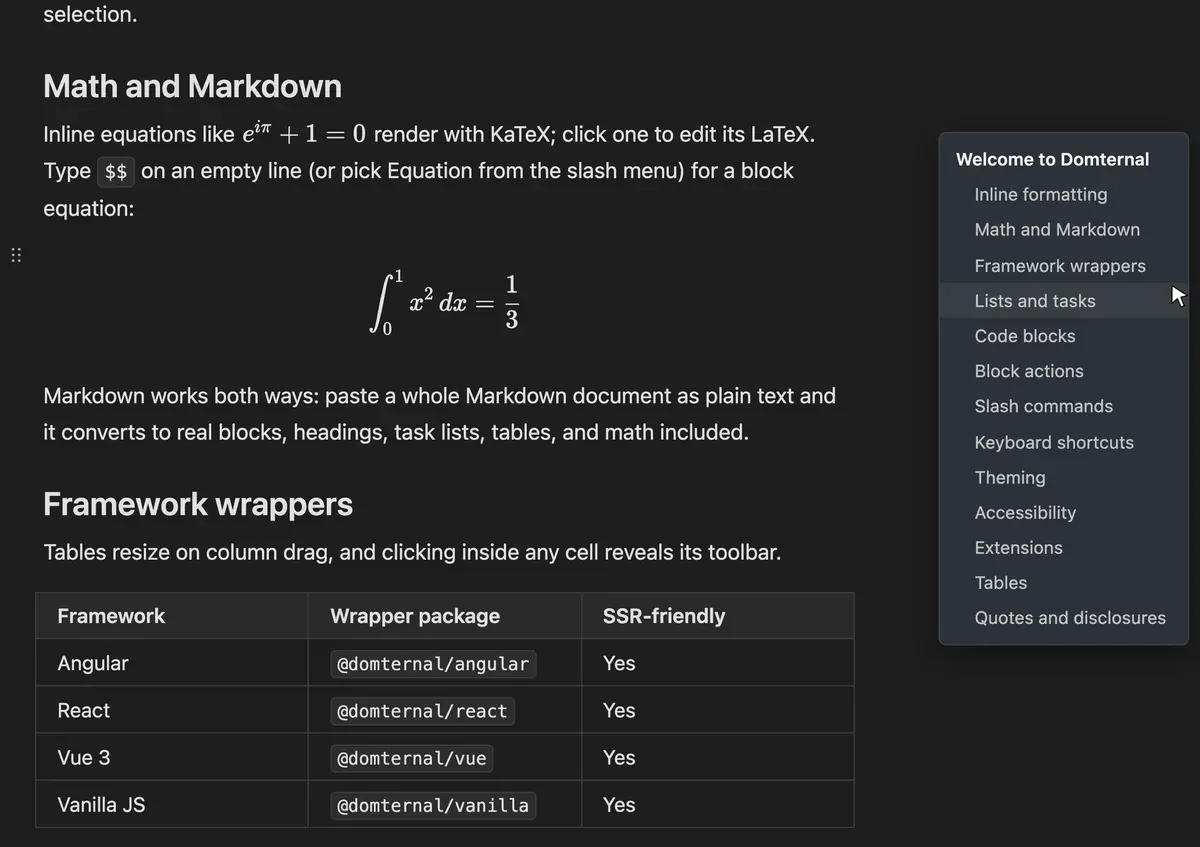
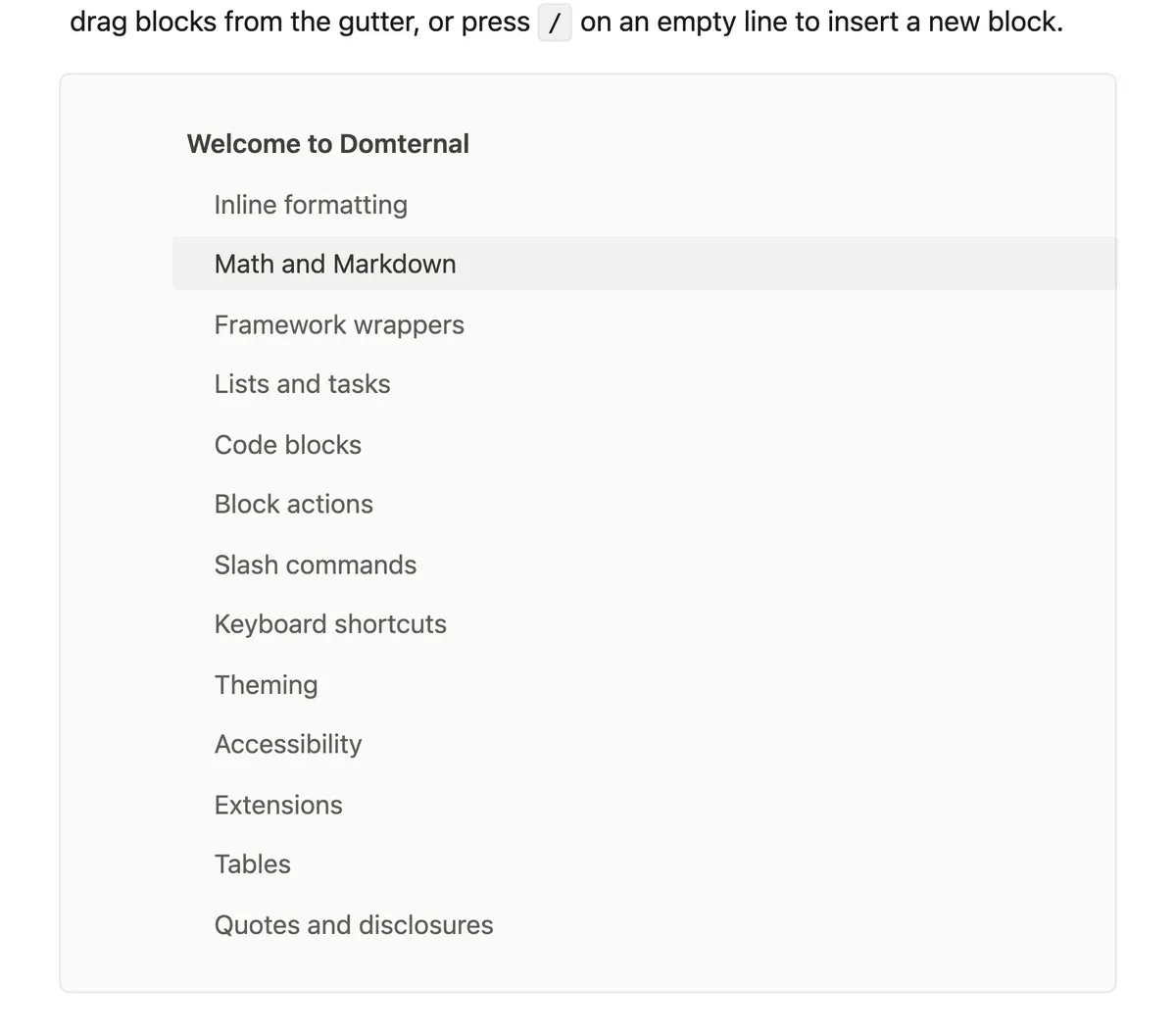
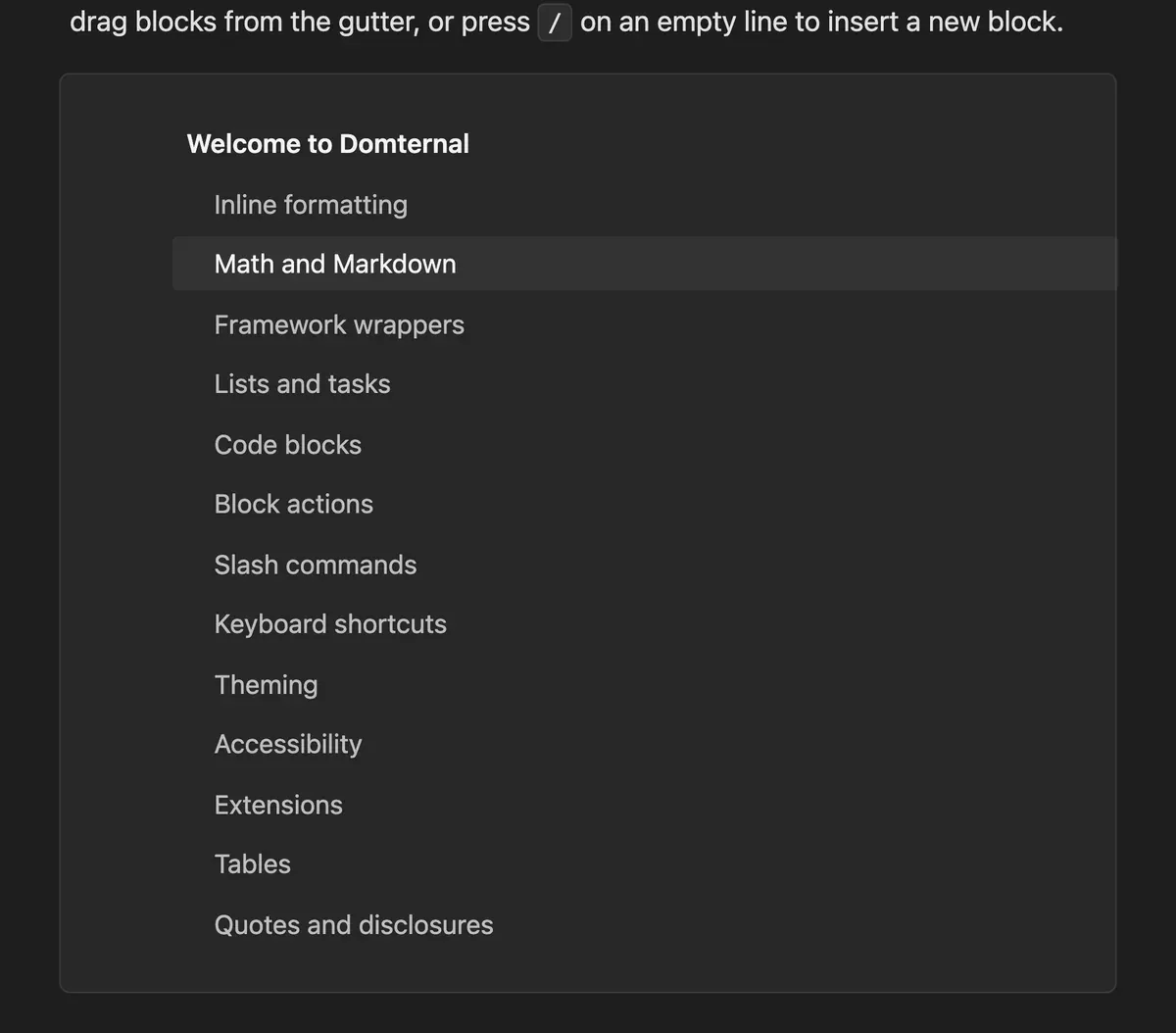
One class on the editor. It drops the toolbar, narrows the column, moves the block handles out into the gutter and upgrades the bubble menu to carry alignment and inline maths. Nothing underneath changes: the schema, the commands and the extensions are the ones the classic preset uses.
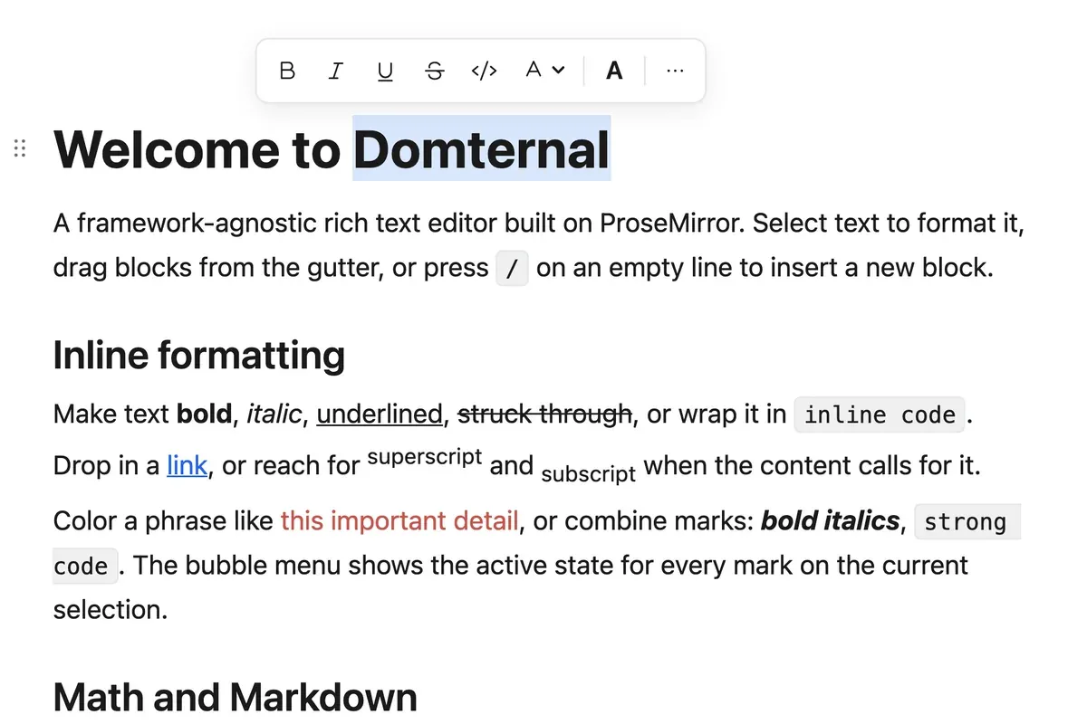
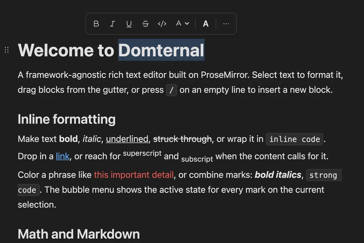
Every screenshot on this page is here twice, once per theme, and the toggle in the corner is what swaps them. The editor works the same way: colours, radii and spacing are all CSS custom properties on the editor root, so a handful of overrides is a brand, and light, dark and auto ship as they are.
Menus carry role=menu with roving tabindex and aria-activedescendant, popovers manage their own focus, and an aria-live region announces what a transaction changed. Every pointer gesture has a keyboard twin: Mod-Shift with an arrow key moves a block without a pointer, and Tab nests a list item.
Everything on this page is in the free packages. Install takes one command.