Lists are where a block editor stops feeling like a textarea and starts feeling like Notion. They are also where the small things show: how tightly a bullet list sits under the one above it, what happens when you drag a to-do into the middle of a checklist, whether converting one item quietly converts the whole list. Domternal 0.9.0 is a release about getting those small things right.
It also makes the editor cheaper to install: the framework wrappers no longer drag in the block-menu package whether you wanted it or not. Here’s everything in 0.9.0.
A lighter install
Through 0.8.0, @domternal/extension-block-menu was a hard peer dependency of every framework wrapper. That made sense when the block layer lived there, but it meant a plain rich-text editor, with no drag handle and no slash menu, still had to install a package full of drag-and-drop machinery it never used.
In 0.9.0 the floating-menu plugin moved into @domternal/core, and the wrappers dropped the peer dependency. A classic editor now needs only two packages:
# 0.8.0 and earlier: block-menu was mandatorynpm install @domternal/core @domternal/theme @domternal/react @domternal/extension-block-menu
# 0.9.0: the wrapper needs only core + themenpm install @domternal/core @domternal/theme @domternal/react
You add @domternal/extension-block-menu back the moment you want the Notion behaviors, the block handle, slash menu, drag-and-drop, exactly as the tutorials do. Nothing about the block layer changed; it’s just opt-in now instead of bundled in.
List rhythm that matches Notion
Domternal renders each list type in its own container: a <ul>, an <ol>, a <ul data-type="taskList">. That keeps the HTML clean and semantic, but it had a side effect. Two stacked lists of different types are two sibling containers, and the gap between containers was the full block margin, so a bullet list followed by a numbered list followed by a to-do list drifted apart into three loosely-spaced islands. Notion, which models everything as one flat block stream, keeps them in a single tight rhythm.
0.9.0 closes that gap. In Notion mode, adjacent lists of different types now chunk together at the within-item gap instead of the wider container margin. And in both modes, a nested list tucks in tightly under its parent label rather than floating below it.
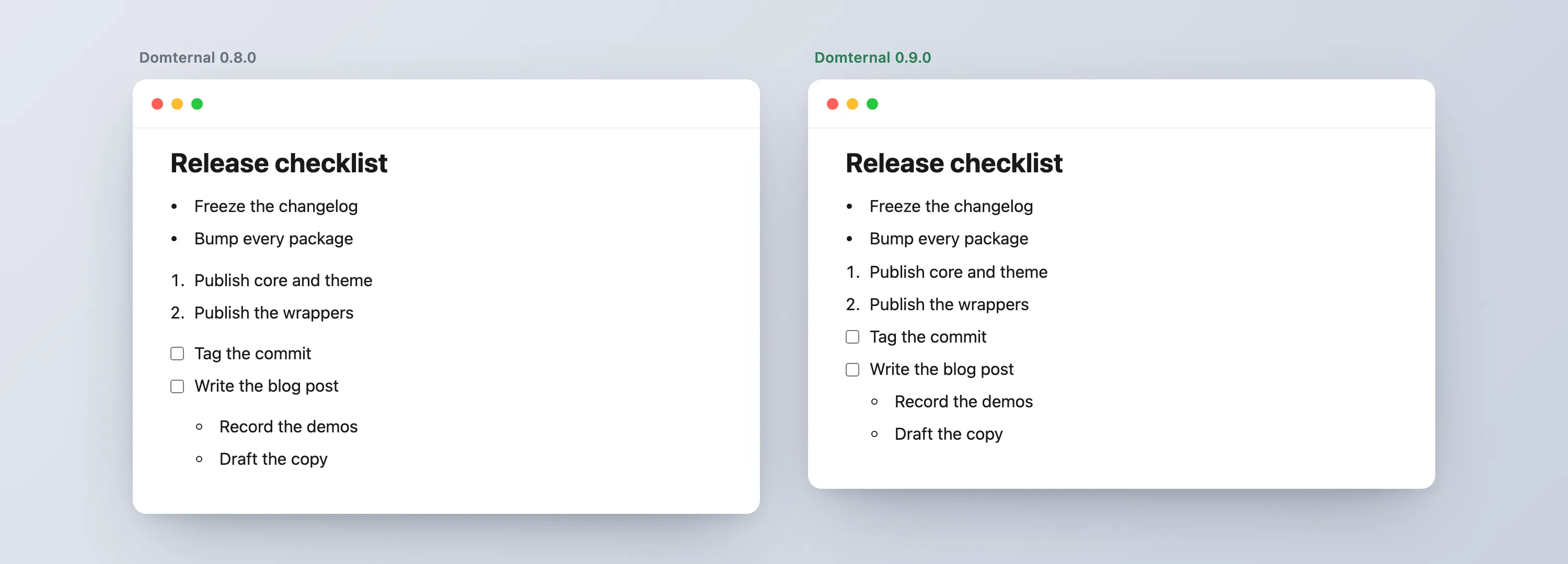
It’s pure CSS in @domternal/theme, so you get it by upgrading: the nested-list tightening applies everywhere, and the adjacent-list tightening rides along with the dm-notion-mode class. Classic editors keep their roomier document spacing unless they opt into Notion mode.
Turn one list item, not the whole list
“Turn into” is the Notion verb for converting a block to another type. The question is what “the block” means when your cursor is inside a list. Select a whole list from the toolbar and you mean the list. Open the slash menu or the block handle on a single bullet and you mean that one item.
0.9.0 makes both true at once. The toolbar button and keyboard shortcut still convert the whole list, but the slash command and the block context menu now convert a single item, splitting the list cleanly around it:
The middle bullet becomes a to-do; the items above and below stay bullets. Three new commands back this: turnIntoBulletList, turnIntoOrderedList, and turnIntoTaskList, the per-item counterparts to the existing whole-list toggles.
List items keep their kind
Drag a to-do out of its checklist and drop it into the middle of a bullet list. What should it become? Before 0.9.0 a dropped item would adopt its new neighbors’ type. That’s occasionally what you want and usually not: you grabbed a checkbox because it’s a task, and you’d like it to stay one.
Now a list item keeps its own kind across a drag, and across a paste:
The to-do lands between the bullets as a checkbox, and the bullet list splits around it instead of swallowing it. The same release tightens the surrounding edge cases: a numbered list that gets split renumbers from the top of each half instead of continuing, and dragging a whole list container closes ranks correctly on both sides of the move.
Outdent that doesn’t break your to-do
In Notion, a list item can hold sub-content: extra paragraphs tucked under its label, indented but still part of that item. Pressing Shift+Tab on one of those nested blocks should lift just that block out, not dismantle the item it lived under.
Earlier releases got this right only when the block sat under the last item in the list. Under any earlier item, outdenting dissolved the parent to-do into a plain paragraph, and its checkbox vanished. 0.9.0 splits the list instead:
The note lifts out to a top-level block between the two halves, and both surrounding to-dos keep their checkboxes. It’s opt-in through the ListIndent extension, so the classic editor’s plainer Tab behavior is untouched.
The papercuts a comment box found
0.9.0 also lands the four bugs that building a Vue comment box surfaced: the placeholder now paints on an empty editor’s very first draw, suggestion popups can escape a one-line editor instead of being clipped, mention and emoji items select on mousemove so a resting pointer no longer overrides your arrow keys, and the table cell toolbar stays inside the editor when it flips. The full story of how a one-line composer caught all four is in that post.
React: synchronous first render
React’s useEditor creates the editor after mount, which is the SSR-safe default. If you’re client-only and want the editor present on the very first render, 0.9.0 adds an opt-in:
const { editor, editorRef } = useEditor({ extensions, immediatelyRender: true, // editor exists on first render, not after mount});It defaults to false, so existing apps render exactly as before. Turn it on only when you control the environment and want to skip the one-frame mount gap.
Upgrade
# block handle, slash menu, drag-and-drop (optional):If you only use the classic editor, this is the release where you can drop @domternal/extension-block-menu from your dependencies. The full list of changes is in the changelog.
- Notion Mode guide - the full block setup, list rhythm and all
- Block Menu API - the handle, slash menu, and Turn into options
- GitHub - MIT licensed, issues and stars welcome
What’s the list interaction that still feels off compared to the editor you reach for? Tell me, and there’s a good chance the next release is where it gets fixed.