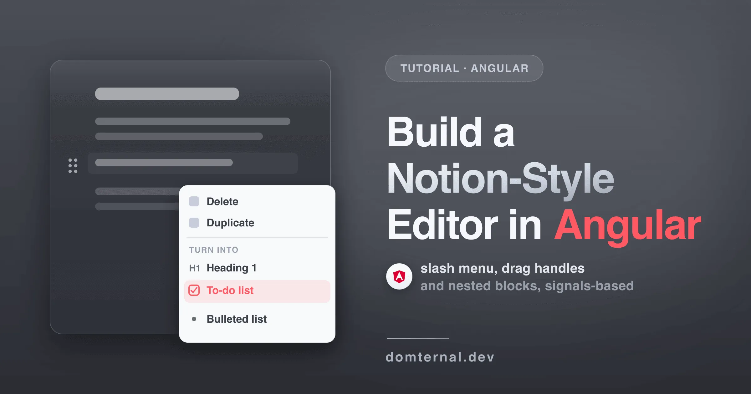
Notion set the bar for how editing should feel: type / to insert anything, grab a handle to drag blocks around, nest them, recolor them, never think about a toolbar. React developers get a dozen libraries chasing that bar. Angular developers usually get told to wrap one of them and hope.
This tutorial builds the real thing natively: a Notion-style block editor in one standalone Angular component, about 80 lines, signals-based, running on zoneless Angular. We use Domternal, an MIT-licensed rich text editor built on ProseMirror that ships actual Angular components, not React bindings in a trench coat. If you want to see the end result before committing, the Notion Mode guide has a live demo. Every snippet below was run, not just compiled.
Building in React instead? The same editor, same steps: Build a Notion-Style Editor in React.
What you’ll build
- A borderless writing surface - no chrome, no toolbar, just a page
- A slash menu - type
/and insert headings, lists, quotes, code blocks - Drag handles - hover any block, grab the six dots, reorder with nested drag-and-drop
- A block context menu - Delete, Duplicate, Turn into, Copy link, Colors
- A bubble menu - select text, format inline
- An optional floating outline - a scroll-spy table of contents on the page edge
Here’s the slash menu we’ll have by the end of step 3, recorded from this tutorial’s own component:
Step 1: Install
npm install @domternal/core @domternal/theme @domternal/angular @domternal/extension-block-controlsFour packages: @domternal/core is the headless editor engine, @domternal/theme is the default stylesheet (plain CSS variables, fully overridable), @domternal/angular ships the standalone components, and @domternal/extension-block-controls is the block layer that powers everything Notion-ish - the handle, the slash menu, the context menu. We’ll add the table-of-contents extension in an optional step at the end.
The theme is global CSS, so it goes in styles.scss rather than a component:
@use '@domternal/theme';Step 2: A minimal editor
import { Component, ChangeDetectionStrategy } from '@angular/core';import { DomternalEditorComponent } from '@domternal/angular';import { StarterKit } from '@domternal/core';
@Component({  selector: 'app-notion-editor',  changeDetection: ChangeDetectionStrategy.OnPush,  imports: [DomternalEditorComponent],  template: `    <domternal-editor [extensions]="extensions" [content]="content" />  `,})export class NotionEditorComponent {  content = '<p>Hello world</p>';  extensions = [StarterKit];}
That’s a working rich text editor. Three things worth knowing before we go further:
<domternal-editor>is the editor surface itself. The component host carries thedm-editorclass, and every floating element - menus, popovers, pickers - positions itself inside that element. You don’t wrap it in anything special.extensionsis a plain class field. The component tracks the input reactively - swap in a different array and it recreates the editor, content preserved - so a plain field is all the wiring you need. StarterKit bundles the usual nodes and marks (headings, lists, bold, italic, history), and every piece can be switched off viaStarterKit.configure().- All Domternal components are standalone, OnPush and signal-driven. There’s no NgModule to import and nothing to subscribe to manually.
Step 3: Turn it into a Notion-style editor
Now the fun part. The block layer is plain editor extensions - add them to the array, put one CSS class on the component, done:
import { Component, ChangeDetectionStrategy } from '@angular/core';import { DomternalEditorComponent } from '@domternal/angular';import { StarterKit, Placeholder, UniqueID } from '@domternal/core';import {  BlockHandle,  BlockContextMenu,  SlashCommand,  SmartPaste,  KeyboardReorder,} from '@domternal/extension-block-controls';
@Component({  selector: 'app-notion-editor',  changeDetection: ChangeDetectionStrategy.OnPush,  imports: [DomternalEditorComponent],  template: `    <domternal-editor      class="dm-notion-mode"      [extensions]="extensions"      [content]="content"    />  `,})export class NotionEditorComponent {  content = '<h1>My page</h1><p></p>';  extensions = [    StarterKit,    UniqueID,    Placeholder.configure({      placeholder: ({ node }) =>        node.type.name === 'paragraph' ? "Press '/' for commands" : '',    }),    BlockHandle.configure({ nested: true }),    BlockContextMenu,    SlashCommand,    SmartPaste,    KeyboardReorder,  ];}
What each piece does:
BlockHandlerenders the six-dot drag handle in the left gutter when you hover a block, plus the+button that inserts a block below.nested: trueis the option people forget - it unlocks multi-level drag-and-drop (step 5).BlockContextMenuis the menu behind the handle: Delete, Duplicate, Turn into, Copy link - plus a Colors section onceBlockColorarrives in step 4.SlashCommandopens the insert menu on a typed/- and only a typed one, so pasted text never triggers it.SmartPastecleans up block-level paste at inline positions;KeyboardReorderaddsMod+Shift+ArrowUp/Downto move the top-level block containing the cursor, the keyboard companion to dragging.UniqueIDstamps every block with a stable id. Copy link needs it now, and the outline in step 6 needs it too.Placeholderin its function form shows thePress '/' for commandshint on the empty paragraph you’re on, and nothing on headings.dm-notion-modeon the editor is the visual preset: it drops the border, centers a 38rem content column and moves typography onto a page-like rhythm.
One layout note: the drag handle lives in the margin about 3.5rem to the left of the content column. Give the editor’s container that breathing room and don’t clamp it with overflow: hidden, or the handle gets clipped.
The block handle and its context menu in action - hovering reveals the handle, clicking it opens the menu, and Turn into converts the paragraph to a to-do:
Step 4: Bubble menu and block colors
The menus with visible UI - bubble menu, floating insert menu, color picker - are Angular components, not extensions. That split is deliberate: extensions run headless inside the editor, components render UI and register their own positioning plugins. So BubbleMenu never appears in the extensions array; you drop <domternal-bubble-menu> in the template instead. The color picker is the one hybrid: the NotionColorPicker extension owns the palette and the bubble menu’s A trigger, while the Angular component renders the panel.
import { Component, ChangeDetectionStrategy, signal } from '@angular/core';import {  DomternalEditorComponent,  DomternalBubbleMenuComponent,  DomternalFloatingMenuComponent,  DomternalNotionColorPickerComponent,} from '@domternal/angular';import {  StarterKit,  Placeholder,  UniqueID,  TextStyle,  TextColor,  Highlight,  BlockColor,  NotionColorPicker,  ListIndent,} from '@domternal/core';import type { Editor } from '@domternal/core';import {  BlockHandle,  BlockContextMenu,  SlashCommand,  SmartPaste,  KeyboardReorder,} from '@domternal/extension-block-controls';
@Component({  selector: 'app-notion-editor',  changeDetection: ChangeDetectionStrategy.OnPush,  imports: [    DomternalEditorComponent,    DomternalBubbleMenuComponent,    DomternalFloatingMenuComponent,    DomternalNotionColorPickerComponent,  ],  template: `    <domternal-editor      class="dm-notion-mode"      [extensions]="extensions"      [content]="content"      (editorCreated)="editor.set($event)"    />    @if (editor(); as ed) {      <domternal-bubble-menu [editor]="ed" />      <domternal-floating-menu [editor]="ed" [requireExplicitTrigger]="true" />      <domternal-notion-color-picker [editor]="ed" />    }  `,})export class NotionEditorComponent {  editor = signal<Editor | null>(null);  content = '<h1>My page</h1><p></p>';  extensions = [    StarterKit,    UniqueID,    Placeholder.configure({      placeholder: ({ node }) =>        node.type.name === 'paragraph' ? "Press '/' for commands" : '',    }),    TextStyle,    TextColor,    Highlight,    BlockColor,    NotionColorPicker,    ListIndent,    BlockHandle.configure({ nested: true }),    BlockContextMenu,    SlashCommand,    SmartPaste,    KeyboardReorder,  ];}
New pieces:
editor = signal<Editor | null>(null)fed by(editorCreated)- the instance doesn’t exist until the editor mounts, so the menu components sit behind@if (editor(); as ed). A signal plus built-in control flow is all the wiring there is.TextColor,Highlight,BlockColorandNotionColorPickerpower the color system:TextColorandHighlightown the text and background color commands, writing through theTextStylemark (the editor throws at startup without it),BlockColoradds block-level colors and feeds the context menu’s Colors section, andNotionColorPickerprovides the nine-token Notion palette behind the bubble menu’sAtrigger.ListIndentadds cross-boundary indenting on top of the in-list Tab/Shift+Tab handling StarterKit already ships: Tab on a block right after a list nests it into that list. It’s off by default in StarterKit - Tab capture is wrong for plain forms - so Notion-style editors opt in explicitly.[requireExplicitTrigger]="true"keeps the insert menu quiet until you click the handle’s+button; the keyboard route to inserting blocks stays the typed/. Without it the menu pops up on every empty line, which gets noisy. Note that this is an input on the component - the component registers its own floating-menu plugin, so this is where the option lives in Angular.
Select some text and the bubble menu appears with inline formatting:
Step 5: Nested drag-and-drop
No new code - nested: true from step 3 already did the work. Since Domternal 0.8.0 the drop model is gap-first: while dragging, the indicator tracks the nearest gap between blocks, and moving the pointer horizontally picks the nesting depth. A paragraph dropped on a list item’s child slot becomes an indented child block of that item, and a dragged list item keeps its own kind wherever it lands - it joins a same-kind list at the target or becomes its own single-item list. To-dos stay to-dos, bullets stay bullets.
One schema caution: Domternal’s list items use the strict Notion shape out of the box - a paragraph first, then any nested blocks. Documents saved with other editors, or with Domternal before 0.7, may have list items whose first child isn’t a paragraph, and those won’t parse until migrated. The List Item docs cover the migration.
Step 6 (optional): A floating outline
The scroll-spy outline that lives on the page edge is its own package:
npm install @domternal/extension-tocimport { TableOfContents, FloatingTocOutline } from '@domternal/extension-toc';
extensions = [ // ...everything from step 4, TableOfContents, FloatingTocOutline.configure({ anchor: 'viewport' }),];Two things to know:
TableOfContentsreads ids, it never writes them - heading anchors come from theUniqueIDextension you added in step 3, which is why it’s a hard prerequisite.anchor: 'viewport'pins the outline to the right edge of the screen, which is what you want on a scrolling page. The default'editor'anchors it to the editor’s own gutter, for fixed-height editors inside app layouts. Details and options are in the Table of Contents docs.
Running zoneless?
So is this tutorial. Everything above runs on zoneless Angular with provideZonelessChangeDetection - the components are signal-driven, so ProseMirror events land as signal writes and OnPush templates update without zone.js or a single markForCheck(). The one rule: if you attach your own listeners with editor.on(...), wrap the handler body in ngZone.run() on zone-based apps - the Angular guide covers the pattern.
The full component
import { Component, ChangeDetectionStrategy, signal } from '@angular/core';import {  DomternalEditorComponent,  DomternalBubbleMenuComponent,  DomternalFloatingMenuComponent,  DomternalNotionColorPickerComponent,} from '@domternal/angular';import {  StarterKit,  Placeholder,  UniqueID,  TextStyle,  TextColor,  Highlight,  BlockColor,  NotionColorPicker,  ListIndent,} from '@domternal/core';import type { Editor } from '@domternal/core';import {  BlockHandle,  BlockContextMenu,  SlashCommand,  SmartPaste,  KeyboardReorder,} from '@domternal/extension-block-controls';import { TableOfContents, FloatingTocOutline } from '@domternal/extension-toc';
@Component({  selector: 'app-notion-editor',  changeDetection: ChangeDetectionStrategy.OnPush,  imports: [    DomternalEditorComponent,    DomternalBubbleMenuComponent,    DomternalFloatingMenuComponent,    DomternalNotionColorPickerComponent,  ],  template: `    <domternal-editor      class="dm-notion-mode"      [extensions]="extensions"      [content]="content"      (editorCreated)="editor.set($event)"    />    @if (editor(); as ed) {      <domternal-bubble-menu [editor]="ed" />      <domternal-floating-menu [editor]="ed" [requireExplicitTrigger]="true" />      <domternal-notion-color-picker [editor]="ed" />    }  `,})export class NotionEditorComponent {  editor = signal<Editor | null>(null);  content = '<h1>My page</h1><p></p>';  extensions = [    StarterKit,    UniqueID,    Placeholder.configure({      placeholder: ({ node }) =>        node.type.name === 'paragraph' ? "Press '/' for commands" : '',    }),    TextStyle,    TextColor,    Highlight,    BlockColor,    NotionColorPicker,    ListIndent,    BlockHandle.configure({ nested: true }),    BlockContextMenu,    SlashCommand,    SmartPaste,    KeyboardReorder,    TableOfContents,    FloatingTocOutline.configure({ anchor: 'viewport' }),  ];}
That’s the whole thing: slash commands, drag handles with nested drag-and-drop, a block context menu with Turn into and colors, a bubble menu, keyboard block reordering and a scroll-spy outline - in one standalone component.
Where to go next
- Notion Mode guide - the full cross-framework cookbook: keyboard shortcuts, toast handling, configuration recipes
- Block Menu API - every option on BlockHandle, SlashCommand, BlockContextMenu and friends
- Angular guide - reactive forms, signals patterns, custom icons, dark mode
- Theming - 150+ CSS variables for when you want it to stop looking like Notion and start looking like you